
The HammerDB workload derived from TPC-C contains a feature to record the response times for the stored procedures that are run in the logfile. This post shows how you can easily convert this data into spreadsheet format to view the response times you have captured over a run.
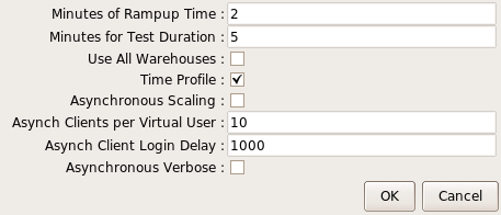
Firstly, to activate the time profile feature select Time Profile for the GUI or the set the equivalent parameter in the CLI to true.
You can note that when loaded the driver script is modified to report response times for the first active virtual user running the workload. (Only the first virtual user is tracked to minimise the impact on the workload). This data is reported every 10 seconds into the HammerDB log. The output is in percentile format reporting the minimum, 50th percentile, 95th percentile, 99th percentile and maximum for each of the procedures during that 10 second interval with an extract shown below.
+-----------------+--------------+------+--------+--------------+
 |PERCENTILES 2019-08-23 04:54:21 to 2019-08-23 04:54:31
 |neword|MIN-812|P50%-2320|P95%-3614.5|P99%-4838|MAX-10610|SAMPLES-2221
 |payment|MIN-281|P50%-1136|P95%-1892|P99%-2344|MAX-3725|SAMPLES-2133
 |delivery|MIN-2931|P50%-4048|P95%-5247|P99%-5663|MAX-5989|SAMPLES-197
 |slev|MIN-1521|P50%-2108|P95%-2629|P99%-2859|MAX-3138|SAMPLES-248
 |ostat|MIN-212|P50%-398.5|P95%-610|P99%-770|MAX-1732|SAMPLES-205
 |gettimestamp|MIN-3|P50%-5|P95%-6|P99%-6|MAX-27|SAMPLES-4753
 +-----------------+--------------+------+--------+--------------+
 |PERCENTILES 2019-08-23 04:54:31 to 2019-08-23 04:54:41
 |neword|MIN-797|P50%-2301.5|P95%-3590|P99%-6458|MAX-10130|SAMPLES-2147
 |payment|MIN-299|P50%-1136|P95%-1840|P99%-2301|MAX-3470|SAMPLES-2124
 |delivery|MIN-2922|P50%-4164.5|P95%-5334|P99%-5802|MAX-6179|SAMPLES-247
 |slev|MIN-1342|P50%-2074|P95%-2700|P99%-2945|MAX-3038|SAMPLES-218
 |ostat|MIN-193|P50%-409|P95%-571|P99%-620|MAX-897|SAMPLES-220
 |gettimestamp|MIN-3|P50%-5|P95%-6|P99%-6|MAX-34|SAMPLES-4735
 +-----------------+--------------+------+--------+--------------+
In text from this data can be useful, however often it is better to view this in graphical form. The simple script below can be run at the command line and provided with a logfile with the data for one run only. (Note that it is important that to convert you only provide a logfile for that to convert, otherwise all of the data will be combined). When run on a logfile with data such as shown above this will output the data in tab delimited format that can be interpreted by a spreadsheet.
#!/bin/tclsh
 set filename [lindex $argv 0]
 set fp [open "$filename" r]
 set file_data [ read $fp ]
 set data [split $file_data "\n"]
 foreach line $data {
 if {[ string match *PERCENTILES* $line ]} {
 set timeval "[ lindex [ split $line ] 3 ]"
 append xaxis "$timeval\t"
         }
     }
 puts "TIME INTERVALS"
 puts "\t$xaxis"
 foreach storedproc {neword payment delivery slev ostat} {
 puts [ string toupper $storedproc ]
 foreach line $data {
 if {[ string match *PROCNAME* $line ]} { break }
 if {[ string match *$storedproc* $line ]} {
 regexp {MIN-[0-9.]+} $line min
 regsub {MIN-} $min "" min
 append minlist "$min\t"
 regexp {P50%-[0-9.]+} $line p50
 regsub {P50%-} $p50 "" p50
 append p50list "$p50\t"
 regexp {P95%-[0-9.]+} $line p95
 regsub {P95%-} $p95 "" p95
 append p95list "$p95\t"
 regexp {P99%-[0-9.]+} $line p99
 regsub {P99%-} $p99 "" p99
 append p99list "$p99\t"
 regexp {MAX-[0-9.]+} $line max
 regsub {MAX-} $max "" max
 append maxlist "$max\t"
     }
       }
 puts -nonewline "MIN\t"
 puts $minlist
 unset -nocomplain minlist
 puts -nonewline "P50\t"
 puts $p50list
 unset -nocomplain p50list
 puts -nonewline "P95\t"
 puts $p95list
 unset -nocomplain p95list
 puts -nonewline "P99\t"
 puts $p99list
 unset -nocomplain p99list
 puts -nonewline "MAX\t"
 puts $maxlist
 unset -nocomplain maxlist
     }
 close $fp
In this example we run the script above, pass the name of the logfile for the run where response times were captured and output them to a file with a spreadsheet extension name. Note that it is important to output the data to a file and not to a terminal with that data then cut and paste into a spreadsheet. If output to a terminal it may format the output by removing the tab characters which are essential to the formatting.
$ ./extracttp.tcl pgtp.log > pgtp.txt
If we look in this file we can see that it has extracted the data and output them into rows with the extracted values.
$ more pgtp.txt
TIME INTERVALS
     04:49:51    04:50:01    04:50:11    04:50:21    04:50:31    04:50:41    04:50:51    04:51:01    04:51:11    04:51:21    04:51:31    04:51:41    04:51:51    04:52:01    04:52:11    04:52:21    04:52:31    04:52:41    04:52:51    04:53:01    04:53:11    04:53:21    04:53:31    04:53:41    04:53:51    04:54:01    04:54:11    04:54:21    04:54:31    04:54:41    04:54:51    04:55:01    04:55:11    04:55:21    04:55:31    04:55:41    04:55:51    04:56:01    04:56:11    04:56:21    04:56:31    04:56:41
 NEWORD
 MIN    457 519 684 734 828 829 795 894 803 880 775 840 774 851 821 792 720 849 751 813 715 879 823 778 853 739 807 812 797 781 841 852 775 865 832 686 805 845 813 822 863 833
 P50    866 1099    1455    1918.5  2318    2267    2271    2307    2315    2347    2299    2296    2301.5  2313    2314    2351    2324    2312    2284    2347    2344 ...
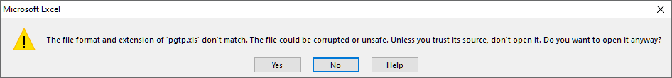
We now have an option. In testing with Excel 2013 we can simply give this file a .xls extension and open it. If we do it will give the following warning, however if you click OK it will open with the correctly formatted data.
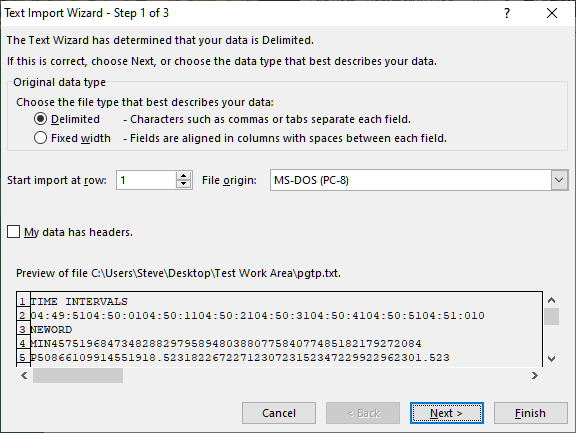
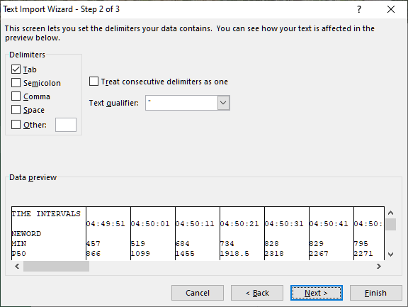
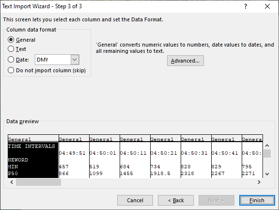
Alternatively if we open the file with the .txt extension it will show 3 steps for the Text Import Wizard. Click through the Wizard until Finish.
After clicking Finish the data has been imported into the spreadsheet without warnings.
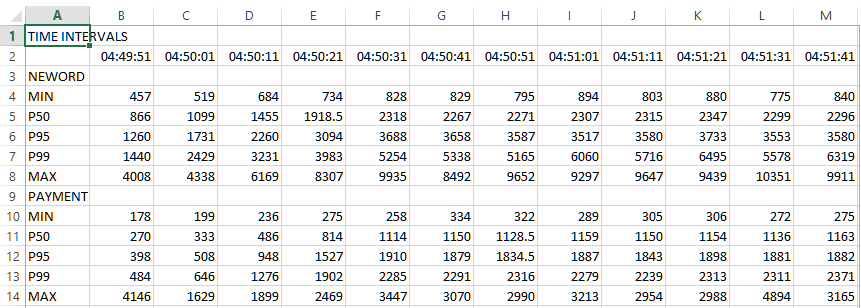
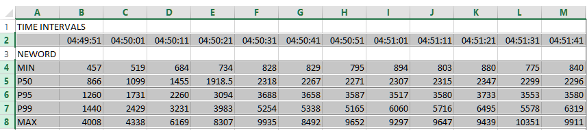
As an example we will highlight the rows we want to graph by clicking on the row numbers.
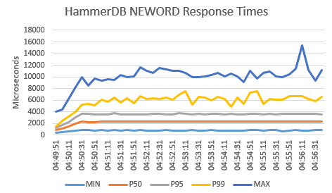
If we then click on Insert and Recommended Charts, the default graph produced by Excel is shown below with the addition of a vertical axis title and a chart header.
Finally make sure when saving the spreadsheet it is saved in Excel format rather than the imported Tab (Text Delimited).
With this approach it is straightforward to turn the captured response times into a visual representation to being further analysis to your workloads.